
Hello Qlikviewers!
We sometimes have a problem when the labels in the X axis is too big to be fitted in our chart properly. Let's see what we can do to make it more presentable.
Let's consider my previous example, in which i explain the carriage return in a field problem Qlikview Carriage Return Post
Now I create a chart with
Dimension: Films
Expression: Count(Films)
In reality this doesnt make sense, as the no of films per film name will always be one for all films. But I am taking this example just to explain the wrap text concept.

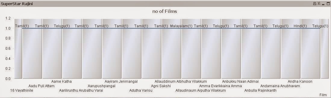
This is what happens, right? We dont get a kind of chart we want.
Now let's make the text in X axis wrapped.
Below is the result of wrapping the same content in the chart 2 above.

change the dimension as below:
Dimension: =Replace(Film,' ',chr(13))
This will replace the spaces with chr(13) which is a carriage return so the text will look wrapped.
Then n the Axes property change the primary label style to / as below.

Hope this was helpful. Like the page below to get more such updates. Contact me either in the contact form or by commenting below for any doubts. Not that i know, I will try to find it out for you and learn along with you.

Hi This is all about A great tool for Data Visualization.....
ReplyDeleteQlikview Online Training
Excellent post!!! The strategy you have posted on this Selenium Training technology helped me to get to the next level and had a lot of information in it.Selenium Training in Chennai
ReplyDeleteThis REALLY has helped me. Thank you!!
ReplyDeleteThis works if the labels are 1 or two words long. My label is a sentence. I'm trying to split it at the nearest space to the 15th character.
ReplyDelete